3. Selecting background colour
On a typical modern screen you can choose from over 16 million colours but this does not mean that you should choose one at random!. The background colour should be easy on the eye and provide good contrast against text and images.
Which of these is better choice?
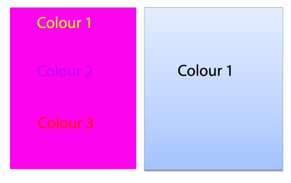
The low-contrast, high brightness screen on the left would soon be very tiring. Whilst the pale blue against dark text is a much better choice for prolonged use. That is not to say that bright backgrounds do not have a place - they could be used to grab attention on part of the interface for example.
challenge see if you can find out one extra fact on this topic that we haven't already told you
Click on this link: Choosing background colour