2. Colour selection
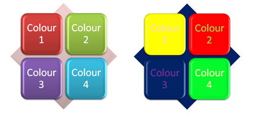
Choosing a colour scheme can make an interface attractive and easy on the eye, or it can be nightmare of jarring colours. Have a look at the two items below. Which do you think is the easier on the eye? I would suggest the one on the left is the more harmonious.
There is a science behind colour selection. Rules have been developed that seem to work for people. Software applications are available that follow these rules which makes setting up a colour scheme fairly straightforward. If you don't have such an application then a good rule of thumb is to limit colours to four per screen and no more than seven overall.
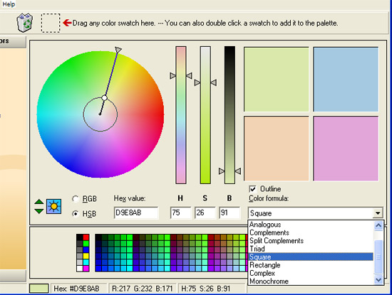
A typical colour selection interface is shown below. Notice the drop-down box that has 'Analogous', 'Complements', 'Split Complements' and so on. Each of these is a colour rule. You pick a colour from the colour wheel and the application automatically selects a pallete based on that selection and the rule chosen.
challenge see if you can find out one extra fact on this topic that we haven't already told you
Click on this link: Online colour selection