10. Quantity of information
Don't present too much
Only present just enough information on a single screen and no more. Too much information makes for a difficult interface that is hard to use.
Use logical organisation
Group information into logical blocks. Use multiple pages if need be. This will be simpler than one huge interface that tries to show everything at once.
Some interfaces hide inessential items until a 'parent' icon triggers them to appear. 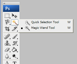
For instance in Photoshop clicking on a tool icon may cause a 'pop-out' menu to appear that has related tools. Keeping them out of sight helps keep the screen clutter-free. The downside of doing this is that the user has to be aware of what is in the hidden menus in the first place.
Split up long numbers
Another design trick to do with long numbers is to split them into groups of four. For example the interface might include displaying a long serial number or telephone number like this
983484927667839928
This is very difficult to copy down on paper or dial if it is a telephone number. So try to lay them out like this
9834 8492 7667 8399 28
Spacing them out into short groups makes them much easier to deal with.
challenge see if you can find out one extra fact on this topic that we haven't already told you
Click on this link: interface information overload