11. Font formatting
There are tens of thousands of fonts to choose from. From ornate gothic to plain text.
Making a bad font decision can lead to eye strain, inefficiency and perhaps plain anger / frustration as people stuggle to use the interface.
If it is a commercial operation then it could lead to lost customers.
Here are some useful rules
Use legible fonts to impart information
Whenever it is important for the user to read information, the font must be clear and legible.
This is a reasonable choice of font for this task
![]()
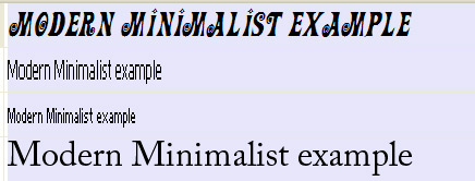
This is not:
![]()
Keep the fancy graphical fonts to non-information elements such as logos or headers.
Use sans serif fonts for screen use such as Arial and Verdana. Serif fonts such as Times Roman are harder to read on-screen
Choose a size suitable for the intended audience
- For adults, ten or twelve point text is fine
- For young children a larger fonts may be more appropriate
- For specialist interfaces intended for those with poor eyesight, use larger fonts
Choose a suitable font to reflect the tone of the interface
A sober, serious interface will use standard sans-serif font whilst a funky, fun interface might use more 'informal' fonts.
challenge see if you can find out one extra fact on this topic that we haven't already told you
Click on this link: Selecting a font