14. Standard interface controls (continued)
Radio / Option buttons
These offer a number of choices but only one can be made at a time. 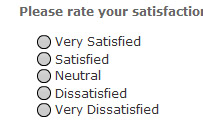 Radio buttons should be grouped together with a label and perhaps a frame around them to highlight that they belong to a single group.
Pro: Forces user make a single choice from the group
Pro: No typing needed so cannot make spelling mistake
Con: User may want to make more than one selection, which option buttons do not allow
Text Box
Allows multi-line text to be entered. If there is a text limit, it it often courteous to let them know what that limit is. For example 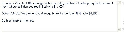
Max: 1000 characters
A poor interface might simply pop up a warning after submitting the data simply saying "Too many characters". This is very annoying for the user who has wasted time entering the information, and still they do not know what the limit is!
Pro: Allows user to enter multiple lines of text
Pro: User can enter free-form information as perhaps feedback or comments
Con: Character count limit may not allow all your message to get through
Con: Spelling mistakes may result in invalid data entry
Input box
Allows single line text to be entered
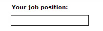
The interface should provide some feedback when an invalid entry is made (or no entry at all) and some further information as to what is a valid entry
Pro: Allows user to enter a single line of data
Pro: System can validate data entry before being accepted
Con: Formatting required may not be obvious unless there is additional information supplied to the user
Con: Easy to make spelling mistakes and so become an invalid entry, this is especially true when characters are hidden as in most password input boxes.
Combo Box
Very useful for making a single selection from a list of items. 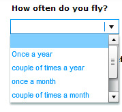 The 'drop-down' list appears when the combo-box is triggered. Keep the font size to a reasonable size as tiny text is difficult to read
Pro: Good for making a single choice from a list
Pro: Very space efficient as the list is not visible until the combo box is triggered
Pro: List can overlap other controls without any problem
Con: List must use reasonably sized fonts to be legible
Con: Complicated, user must choose from possibly a very large list, for instance picking a country from a large list
Con: Confusing if the choices are too similar or vague. e.g. picking a colour from 'pale red', 'pink', 'rouge', 'red'
Con: Some users may not be aware that it is a combo-box and that there is choice to be made
List Box
Similar to the combo box but allows multiple selections to be made 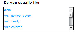
Pro: Allows multiple choices to be selected from a list
Con: Similar problems to the comb-box.
There are also a number of less used controls such as
- Spinners: Let you select a number from a sequence
- Calendar pop-ups: Lets you pick a date from a miniature calendar
- Colour Picker: Lets you choose a colour
challenge see if you can find out one extra fact on this topic that we haven't already told you
Click on this link: designing online forms