

 GCSE ICT
  Presentations Theory
7. Making a presentation look good
The following points will help you to avoid some of the common mistakes made when creating a presentation.
Make text large enough The temptation is to use 12-14 point since you can read that on your screen whilst you are typing. However, project this up onto a whiteboard and the audience will be unlikely to be able to read what you have written. |
 |
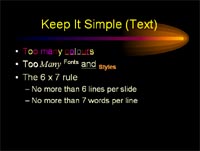
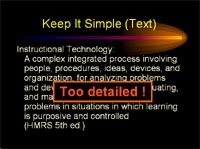
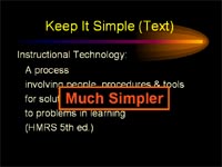
Keep it simple This is easier said than done. Try to stick to only a few font colours, one for the heading, one for the main text and one for highlighting key points. Try to stick to bullet points, large paragraphs of text should not be included if at all possible. |
 |
 |
 |
 |
 |
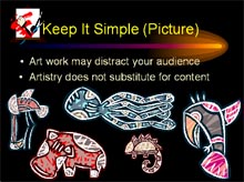
Pictures Images can really help to enhance your presentation if used correctly. The general rule is one or two appropriate images on a slide. They should not obscure any text and they should be large enough to make an impact. |
 |
Sound Again, sound can enhance your presentation, but make sure that it isn't so loud that it would drown out you speaking and make sure that it won't distract your audience from what you are saying. |
 |
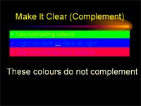
Colours Think about the colours you are using, some colours clash with one another, other colours don't project well onto a screen. |
 |
Background Think about the choice of background you use. You may like it, but some backgrounds are so distracting that the audience would find it hard to focus on the presentation. |
 |
Challenge see if you can find out one extra fact on this topic that we haven't already told you
Click on this link: Effective Presentations
Copyright © www.teach-ict.com