13. Viewing a web site
Web sites are now viewed in a number of ways and this affects the design of the site.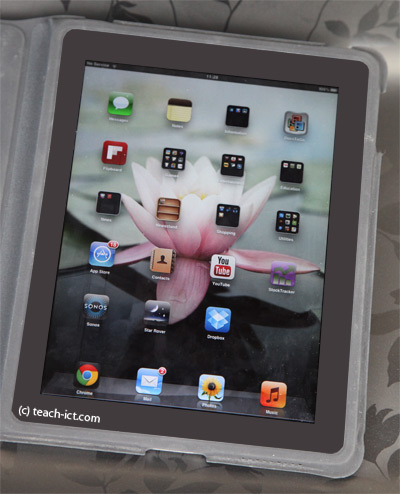
It is no longer the case that web sites are just viewed on a large computer screen. For example, smart phones, tablets and e-readers can view web sites.
The problem is that if a site is designed with a fixed width, say 900 pixels, this is fine for a standard screen, but it looks horrible on a small smart phone.
To overcome this, many web sites are now designed to change shape depending on what is being used to view it.
This is called 'responsive design'.
The way it works is when a page request arrives at the web server, it usually knows what kind of machine made the request (tablet etc) and so this causes a small bit code on the page to re-set page and image sizes to suit and send that page to the machine.
This can be quite tricky to do and so many 'web frameworks' are available that designers can use that have a built-in responsive feature.
Challenge see if you can find out one extra fact on this topic that we haven't already told you
Click on this link: The top web design frameworks