5. Scatter or X-Y charts
A scatter or x-y chart looks like this
Each point on a scatter graph has a pair of values - one value for the horizontal (X) axis and the other for the vertical (Y) axis.
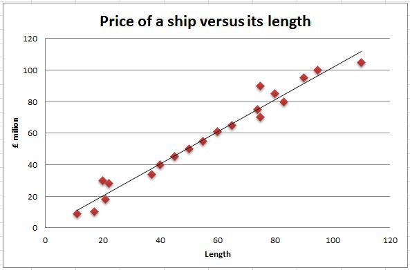
For example, someone wants to know if there is a relationship between the length of a yacht and its asking price. So the information is gathered, loaded into a spreadsheet and graphed as an xy chart.
Once the data is presented as a chart it is easy to see if there is a relationship between the two variables (price and length of ship). If you can draw a reasonable straight line through the points, it means that they are strongly related.
This line is called the 'trend' line. On the other hand if the points seem to be in a random cloud, then there is no relationship.
A spreadsheet can calculate and present the trend line automatically.
So a scatter graph is excellent for seeing a relationship (correlation) between a pair of data items.
Other examples of data where there might be a relationship are:
- Age and height
- Temperature and number of ice creams sold
- Time of the day and amount of electricty used
Challenge see if you can find out one extra fact on this topic that we haven't already told you
Click on this link: Using an xy scatter chart