3. The Line chart
A line chart looks like this:
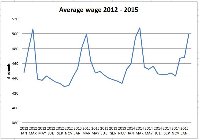
The chart is showing the average wage from January 2012 through to January 2015. Because it is laid out as a line chart, you can easily see that there is a small rising trend over time. You can also see that there are peaks in the data. A table of data would be much harder to interpret.
A line chart is excellent for:
- Displaying continuous data such as a time series
- Seeing trends in the data
Note that a good chart or graph should have a title and the axis clearly labeled.
Challenge see if you can find out one extra fact on this topic that we haven't already told you
Click on this link: spreadsheet graphing