4. Pie Chart
A pie chart looks like this:
A pie chart is used to show proportions and the total number of values will always add up to 100%.
Each portion of data is viewed as a 'slice' of the overall pie chart.
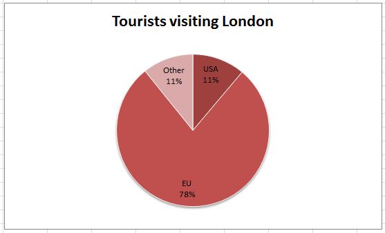
For example the pie chart above is showing where tourists visiting London come from. It shows that 11% of tourists come from the USA but most (78%) come from the European Union.
A pie chart is excellent for viewing the relative proportion of the data being graphed.
Challenge see if you can find out one extra fact on this topic that we haven't already told you
Click on this link: Creating pie charts