2. The Bar Chart
A bar chart looks like this:
Distribution of people by age in the UK in 2013
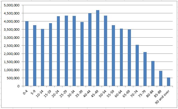
In this case it is a chart showing the number of people in the UK by age bands in the year 2013. (source: Office of National Statistics). This graph also shows a title to explain what it is about.
For example you can see there were 4.5 million people aged between 40 to 44 and only half a million over 90 years old.
The bar chart is excellent for:
- Showing discrete (non-continuous) data such as data sorted into bands
- Being able to compare the relative size of each data item.
This is what the data looks like as a table: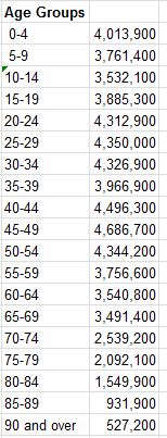
I am sure you will agree that the bar chart makes it a lot easier to see the pattern and overall shape of the data.
Challenge see if you can find out one extra fact on this topic that we haven't already told you
Click on this link: Charting software