6. Charts & Graphs 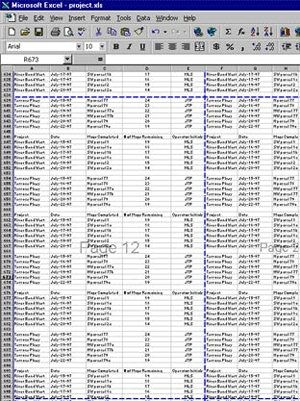
Some spreadsheets can become very large and complex, especially ones which are used to keep track of projects or company finances.
Most people find a large table of data such as the one on the right, hard to analyse.
It is almost impossible to tell at a glance what is happening over a period of time and trends are happening.
For example, is the profit going up each month, is it decreasing?
Are there any peaks and troughs in sales throughout the year?
How does this year compare to last year. And so on.
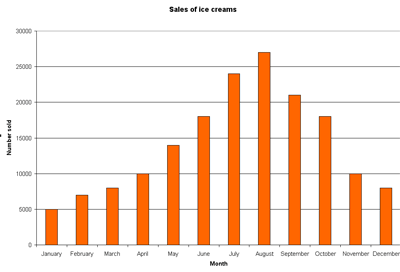
It is much easier for humans to see patterns in data when it is in a picture format for example a graph or a chart.
Have a look at the chart below which shows ice-cream sales during the year (figures are made up).
See how much easier it is to spot trends in the chart than the table? You could instantly spot which months had the highest and lowest sales.
Challenge see if you can find out one extra fact on this topic that we haven't already told you
Click on this link: Charts and Graphs